Soft Signature
Keepsake

A refined identity blending personal signature energy with fine-art editorial softness. Designed to feel elegant, intimate, and keepsake-worthy.

Service Live Wedding Illustration
System Refined Identity System
Art Direction Santhusha
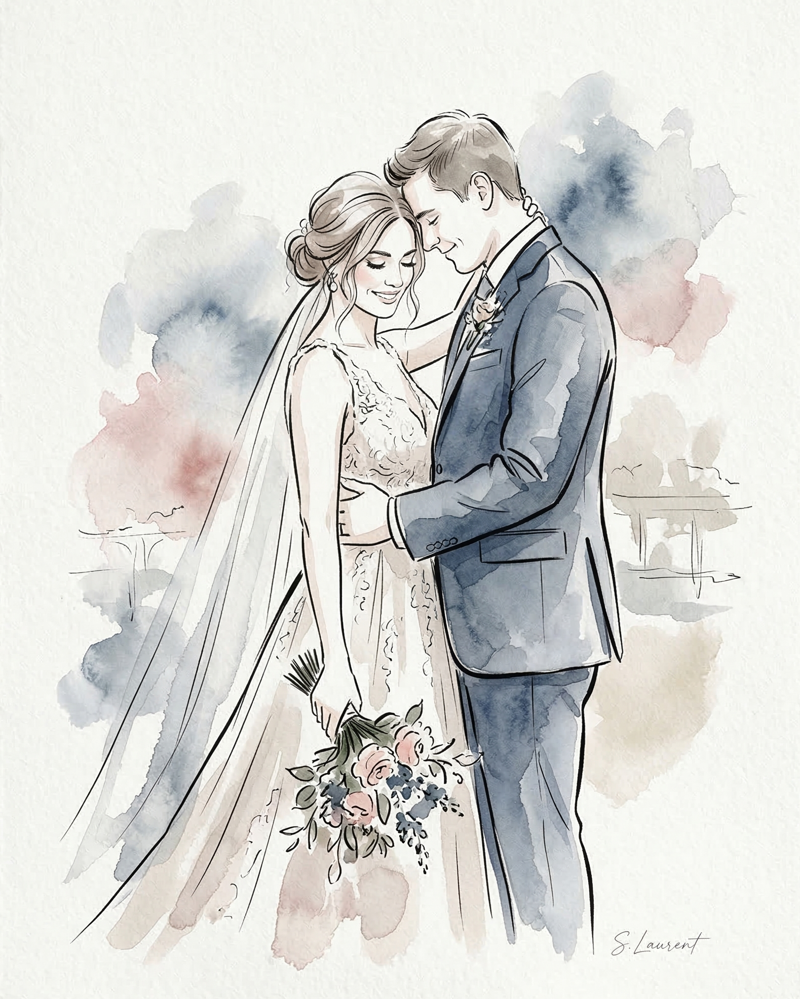
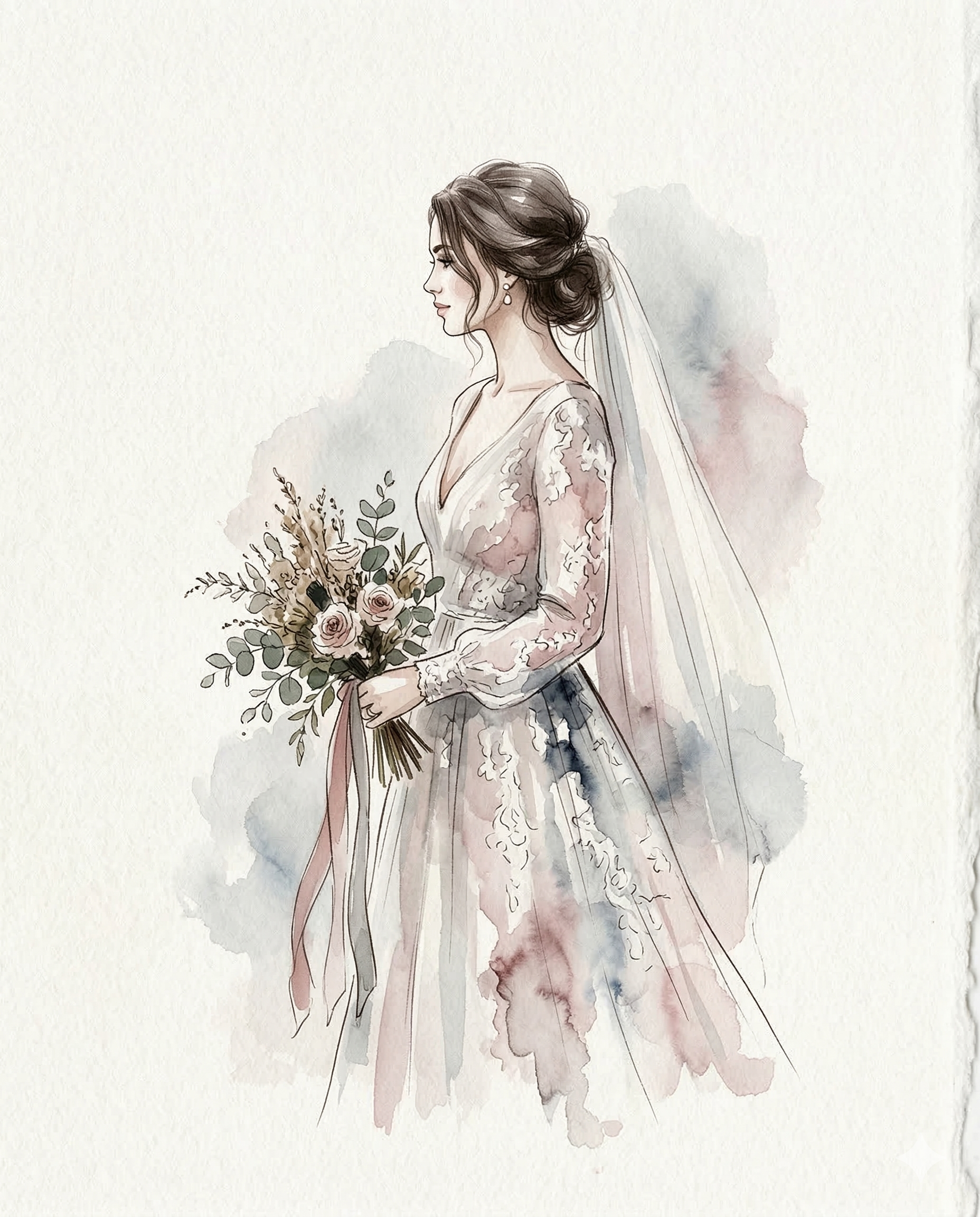
Hero Artwork
Sketches by Sveta

The Story Behind the Direction

A brand that lets the artwork hold the room.

Sketches by Sveta is not simply a wedding service — it is an artistic presence within the celebration. The work captures people with softness, elegance, and likeness, creating portraits that feel more like keepsakes than novelties. That became the foundation for the identity.

The challenge was to create a brand that felt unmistakably romantic and wedding-appropriate, without becoming obvious, overly feminine, or cliché. The answer was not more decoration. It was more restraint. More intimacy. More confidence in the quiet details.

"Soft Signature Keepsake was created to reflect exactly that: a brand world where signature warmth meets editorial polish, and where every visual decision supports the feeling of receiving something personal, beautiful, and worth keeping."
Core Qualities

Quietly elegant. Deeply personal.

This direction is built around five core qualities that define both the work and the feeling of the brand.

Elegant

Refined, graceful, and visually composed.

Personal

Led by the artist’s hand, not by generic wedding cues.

Soft

Gentle in tone, but never weak or overly sweet.

Refined

Structured, premium, and intentionally restrained.

Keepsake

Designed to feel worth holding onto — emotionally and visually.

Colour Language

Pastel-led, anchored for sophistication.

The palette avoids sugary pastels or generic bridal beige. Instead, it uses muted tones with structure—allowing the softness of the artwork to feel elevated, not decorative.

The result is a palette that feels artistic and feminine, but still calm, premium, and modern.

Paper Ivory

The keepsake foundation / #F6F1EA

Muted Ink Blue

The core brand tone / #687A86

Warm Stone

#DDD3C9

Dusty Rose

#D8BCB8

Watercolour

#C3D0D7

Pistachio

#CCD5C8

Identity Suite

A softer kind of structure.

Every piece of the identity is designed to balance the warmth of the artist's hand with editorial polish.

Primary Mark

Primary Mark

The signature as the emotional anchor

Designed to feel like a beautiful artist’s signature elevated into a brand mark. It creates recognition through feeling: elegant, feminine, artistic, and quietly confident.

Secondary Lockup

Secondary Lockup

A more structured expression

Where the primary mark leads with emotion, the secondary lockup introduces clarity. It is designed for situations where the brand needs stronger structure — website headers, printed materials, and formal touchpoints.

Keepsake Seal

Keepsake Seal

The smallest form, designed to feel tactile

The circular seal gives the identity its most intimate and structured expression. It extends the identity’s keepsake quality, feeling considered and collectible — like the final detail that completes the experience.

Artist Sign-off

Artist Sign-Off

A signature for the artwork, not a logo on top of it

The artwork itself needed its own quieter gesture. Subtle, elegant, and unobtrusive. It allows the final work to remain a keepsake first, and a branded asset second.

Touchpoint System

Built to live in the real world.

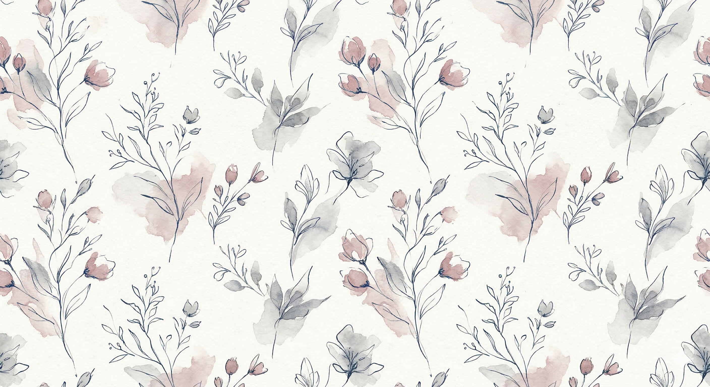
Packaging Language

Designed to turn delivery into part of the keepsake experience. The pattern and seal system make every portrait feel beautifully presented, whether wrapped in tissue or delivered in a clear frosted sleeve.

Seal for closure. Pattern for atmosphere. Artwork for emotion.

Brand Pattern
Wedding Portrait
Sticker

Print Touchpoints

Relying on spacing, tone, and typography to communicate calm confidence.

hello@sketchesbysveta.com

Digital Editorial

Expansive whitespace treating the screen like an editorial spread.

Final Fit

A brand world that feels true to both the work and the audience.

Soft Signature Keepsake was created to position Sketches by Sveta not simply as a service provider, but as an elegant artistic presence. It brings subtle wedding atmosphere without relying on obvious symbols. It feels personal without becoming overly handmade. Most importantly, it creates a visual identity that finally matches the quality of the artwork itself.

Subtle wedding feel through tone, softness, and editorial restraint.
Elegant, never cheesy with composition carrying the romance.
Personal, yet professional balancing artist warmth with clear structure.
True keepsake experience reflecting the lasting value of the portraits.